This is a shorter shortlist as compared to six years ago. Blogging as a distinct medium of online writing has waned, subsumed into all manner of posting in forms defined by a host platform.
At the same time, finding thoughtful online discussions of architecture, landscape architecture, and urban design remains difficult. The below selection is trying to identify sources above the churn of a Dezeen or Archdaily but broader in scope and access than an indexed journal.
Podcasts
While the role of RSS feeds as reading tool is now a niche feature of the web, the technology is silently powering a hugely expanded podcast ecosystem and continuing its promise to easily aggregate a panoply of content.1
Night White Skies
I am wildly behind on listening to Night White Skies. This is a testament to its depth and range — I've stopped listening to it on rides or walks because of a need to actively take notes and look up references over the course of each episode. Its interviews engage practitioners whose work looks to the possible futures of architectural practice2 and the series as a whole offers a pressing survey of contemporary issues and thinking.
- Molly Wright Steenson _ 'Cedric Price's Influence' (46 minutes)
- Bradley Cantrell _ 'A.I. and Wildness' (39 minutes)
- Amy Brady _ 'Burning Worlds' (48 minutes)
About Buildings + Cities
Podcasting as a long tail media really hits home when you discover a three-part miniseries entirely dedicated to a two-year-long chain letter that introduced architectural theories of expressionism in post-WWI Germany. Although the content is nominally niche, the discussions are lively and do a great job of tying the development of a movement, architect, building, or fiction back to a broader architectural and societal context.
Jump in knowing that their Twitter and Instagram provide crucial visual supplements for each episode. A Patreon also provides additional episodes and a way to support a generous contribution to those who teach, study, or are interested in the built environment. Recommended starting points:
- Catastrophe Curves — Early 90s Computer Architecture (91 minutes)
- OMA 1989 — Going Big (77 minutes)
- A 9-episode Le Corbusier biopod, starting with Have Formwork, Will Travel (70 minutes)
Landscape Conversations
A decade ago, in the very early and very underrated era of podcasting, Craig Verzone's Terragrams provided an expansive set of interviews with a wide range of landscape architects. Unfortunately, Terragrams has seemingly vanished from the internet, but Landscape Conversations provides some continuity in subject and style. Be sure to check out Anton's interviews with:
- Kathryn Gustafson (45 minutes)
- Philip Coxall (52 minutes)
- Will Alsop (44 minutes)
99% PI
It's still going, and it's still the best popular-media communication of design history and its major contemporary issues. Having one of my tweets as a footnote for an episode made me unreasonably excited.
- La Sagrada Familia (34 minutes)
- Depave Paradise (38 minutes)
- The Pool and the Stream (32 minutes)
Blogs, Magazines, and Journals
Misfits Architecture
The standard “Western-style” apartment block typology is fairly resistant to change. LMvdR hit it bang on at Lake Shore Drive...
And nothing much has changed since. This post is about how the apartment building typology is being improved upon in other countries. It’s not some condescending “critical regionalism” based on “others” trying to be modern in their own way – usually by adding lots of lovely hardwood shutters and shading devices to your standard white building. Instead, on the very basic level of architectural response to climate, these other apartment buildings are, on the whole, better – apart from in Australia.
Extract from 'How Other Folks Live'.
The eponymous misfits category of posts looks to architects placed outside the canon or awkwardly within it. Those posts, like those covering other topics, feature wonderfully sourced drawings and tend towards extensive analysis in plan. See also:
- Architecture Misfits 22: H Arquitectes
- Good in theory?
- Architecture Misfit 3: Eileen Gray
- The Things Architects Do 1: Compromise
Places Journal
Instead of more gratuitous parametric modeling, we need to think about urban epistemologies that embrace memory and history; that recognize spatial intelligence as sensory and experiential; that consider other species’ ways of knowing; that appreciate the wisdom of local crowds and communities; that acknowledge the information embedded in the city’s facades, flora, statuary, and stairways; that aim to integrate forms of distributed cognition paralleling our brains’ own distributed cognitive processes.
Extract from A City is Not a Computer by Shannon Mattern.
Online for over a decade, Places is the premier example of an internet-native academic journal that offers open access that is actually accessible in its presentation, focus, and quality. Their user-generated reading lists are also an overlooked resource. Recent favourites:
- The Problem with Solutions by Rob Holmes
- “Dreaming True” by Roxi Thoren
- Liquid Cities by William O. Gardner
Procedural Generation
Generativity allows us to recapture an older form of repetition: in contrast with the identical mass-produced objects of modernity, generativity can approximate the subtle variations of the handmade artisanal craft production. Individual generated artifacts can be made unique, even if they are not novel in the aggregate: bolts on an airplane wing generated with minute variations, as in Denis Kozlov’s Project Aero (Kozlov 2017); a unique color scheme, as exhibited by the creatures in Spore (Maxis 2008); or the color of a star in No Man’s Sky (Hello Games 2016). It returns a sense of individuality to the manufactured object, though this time it is the individuality of the machine rather than evidence of the direct human hand.
Extract from Preliminary Poetics of Procedural Generation. Looking at generative methods and thinking across other media is particularly important given the relative paucity of methods and concepts commonly used within the architectural disciplines. See also:
- Expressive Temperature
- When Humans are Parasites on Algorithms
- So you want to build a generator... (repost)
MORPHOCODE
Figure .
Figure . Morphocode, from "The figure-ground diagram".
Supplementing their recent focus on web-based mapping tools, Morphocode's recent blog posts feature extremely well-illustrated introductions and case studies for urban data visualisation:
- Visualizing Pedestrian Activity in the City of Melbourne
- The Power of Interactive Tools
- The Representation of Time in Information Design
E-Flux Architecture
Second, these changes are extremely exciting, but also confusing and destabilizing, because nearly every representational tool used in architecture today was imported from “the outside,” so to speak...
There is nothing wrong with this importation. It has been very productive for the design fields. But it has also meant that the values of other disciplines and practices are imported as well, quietly “smuggled” in the boring, hidden innards and interfaces of the tools themselves. This especially includes scientific, engineering, and industry values such as accuracy, efficiency, precision, predictability, control; everything that falls under the general notion of “workflow optimization,” where these technical values are essential for a “well-functioning” (as defined by those fields) system of any type.
Extract from Zeina Koreitem's Some Notes on Making Images with Computers.
E-Flux's architecture platform is relatively young compared to its host's long history as a journal (2008) and longer history as a mailing list (1998). It's also best consumed in a newsletter format (where event announcements can be filtered out) rather than online (where longer-form pieces and projects are difficult to identify). Have a look at:
- Clone Stamp: Maintaining Architecture's Image by Helen Runting
- 7D Vision by Amelyn Ng
- How to Make a Forest by Cindy Lin
Failed Architecture
Near the tail end of the 20th century, pseudonymous author and technologist Ben Russell released The Headmap Manifesto — a utopian vision of augmented reality referencing Australian aboriginal songlines and occult tomes, while pulling heavily from cybernetic theory and the Temporary Autonomous Zones of Hakim Bey. At turns both wildly hypothetical and eerily prescient, Headmap explores in-depth the implications of “location-aware” augmented reality as a kind of “parasitic architecture” affording ordinary people the chance to annotate and re-interpret their environment.
Around the same time, artist and scholar Teri Rueb began developing her pioneering, site-specific augmented “soundwalks,” some of the earliest and most influential examples of GPS-based art practice. Influenced by land art practitioners such as Robert Smithson and Richard Serra, Rueb’s work identified the critical potential of locative AR as a direct mediator of spatial experience, capable of revealing hidden layers of meaning within landscapes.
Extract from Joshua McWhirter's City Skins: Scenes from an Augmented Urban Reality. For more "critical urban discourse, fuelled by unconventional narratives", see:
- Failover Architectures: the Infrastructural Excess of the Data Centre Industry by Alexander Taylor
- A Year in the Metabolist Future of 1972 by Ana Luisa Soares and Filipe Magalhães
- Betraying the Profession: Design Labour Against Technocracy by Bassem Saad
Assemble Papers
The modernist education system was assumed to be universal, so all students basically studied the same things: same history, same precedents, same technological approach. There was little room for experimentation; but also, whenever you steered off the beaten track of the colonial canon, there was a huge insecurity about what to do with that... Where the unit system differs is that it takes the authority of education and breaks it down. It’s partly to do with personality, partly to do with the tutor’s own lived experience, but it’s also partly to do with the experimental relationship between student and tutor, which is very different from the old master–pupil relationship. So, while it’s a system that evolved in London in the 1970s that I don’t think was ever designed for this context, 50 years later, in a completely different kind of territory, it’s been liberating. And it’s partly been because so much of what you teach is up for questioning.
Extract from Lesley Lokko on Decolonising Architecture as interviewed by Danielle Mileo.
A real estate development group with a biannual design journal is very Melbourne and the result very compelling. Catch it in print if you can; otherwise have a look at:
- On Wellington: Loss and looking ahead by K. Emma Ng
- Daylighting: D.I.R.T. Studio by Emily Wong
- Catherine Mosbach interviewed by Elliet Spring
Uncube Magazine
These kind of late 60’s zippy ideas were – and remain – central to the West Coast techno-utopian dream. Think of Apple Inc., now the most valuable company in the world but named after the orchards of the All-One Farm commune set up by a charismatic, free loving, LSD propagandist. Think of the gigantic techno-Xanadus currently under construction. Of Apple’s perfect sleek Jung circle (complete with its own apple orchard), designed by Foster; of Amazon’s Bucky-bio-sphere-redux; of Google’s BIGwick mega-bottery replete with robot-construction drones.
These are places that are far more than office complexes. They are nothing less than 21st century versions of the kinds of ideal communities, model villages, and utopian settlements that were the foundation of modern urban planning.
Extract from Machines of Loving Grace by Sam Jacob.
Uncube's layouts are best viewed with a large quantity of screen and of patience. These, and other articles, are well worth it:
- Keeping It (un)real: Behind The Facade Of Starchitect Video Marketing by Davide Tommaso Ferrando
- The Line Connects: An essay on drawing and architectural education by Wes Jones
- The Otherness Of The Machine: Jan Willmann from ETH Zurich on robotics in architecture interviewed by Fiona Shipwright
Dan Hill's Medium (formerly City of Sound)
Effectively hiding in plain sight beneath that veneer, the suburban timber frame provides space and structure for numerous other possibilities. Their proposal reverses the thrusters on most Australian housing dynamics, cleverly building inwards rather than outwards in order to maximise shared spare in return. It produces so much out of so little, with more than a nod to the quietly accumulative metabolisms of some Japanese architecture. It is also a richly inventive counter-proposal to the growth fetish monstrosities typically spruiked by The Block (as per another old piece of work, a Maginot Line design strategy for the Commonwealth Government.)
Extract from Slowdown landscapes: The care and repair of our suburbs.
While the shift to Medium and its viewing limits is regrettable;3 especially because of Dan's impressive quantity of writing. Since the advent of the pandemic that output has multiplied yet again and brought earlier thinking on urbanism, urban technology, and design agency to bear on the current moment. Have a look at:
- Network urbanism
- Daylighting Melbourne: how we can transform our cities, street by street
- Shepherd, sheepdog
- A Cloud Atlas for Eindhoven, and believing in society over unicorns
Drawing Matter
It is worth noting that what in retrospect seems like an inevitable conclusion – that a projection of a diamond plan would result in a 90-degree axonometric – is by no means certain. Another architect might have made an adjustment, used a 60-degree projection or otherwise avoided the strange (and difficult to read), figure that emerged. Sometimes a logical pathway leads to an unexpected place. For Hejduk, that spatial ambiguity was precisely what he was after, and it must have felt like a genuine discovery at the time. It completed a kind of circuit for him: ‘The isometric projections of the diamond are cubist projections in architecture, therefore completing the formal relationships between cubist projection in painting and cubist projection in architecture.’
Extract from Stan Allen's John Hejduk’s Axonometric Degree Zero.
Drawing Matter publishes around its vast archive of architectural drawings and models - 558 texts by 287 writers on 506 architects and 2378 drawings (and counting). Articles range from annotated galleries to reproductions and longer reflections, such as:
- Trees Make A Plan by Sylvia Lavin
- Drawing People by Daniel Innes
- Stirling At Stuttgart: Rear View / Up Views by John Tuomey
- W.E.B. Du Bois’ Visionary Infographics by Sarah Handelman
Image Blogs
The currency of 'image blogs' seems to have declined hand-in-hand with the death of tumblr. On the web,4 Pinterest has seemingly taken its place and simultaneously laid waste to Google's image search. Seemingly few outlets persevere in the task of meaningfully curating collections instead of reducing the study of precedents to #inspiration walls.
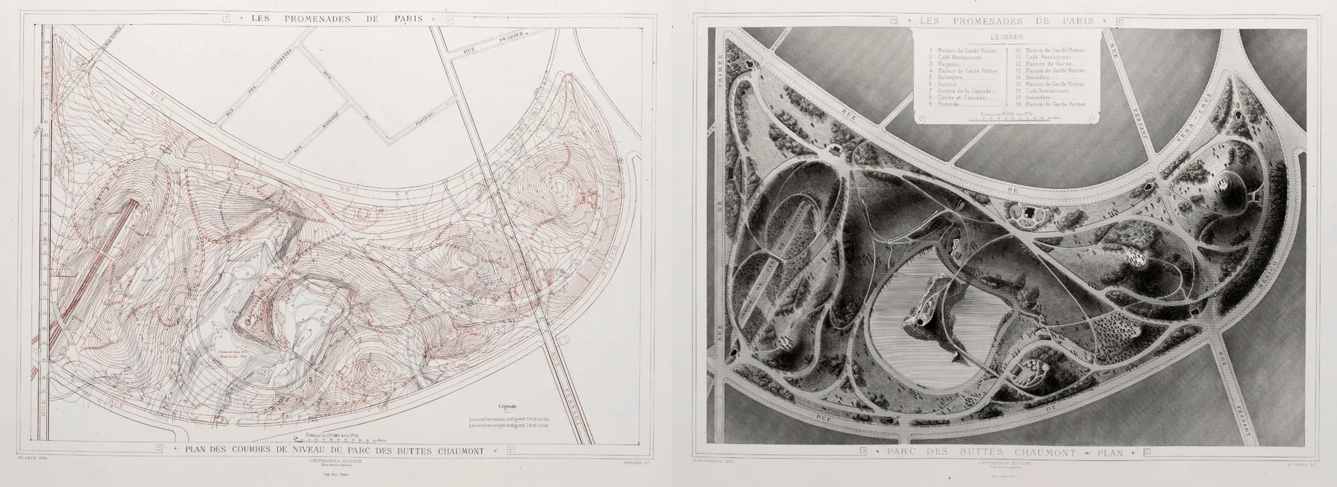
Atlas of Places
Figure .
Figure . . Adolphe Alphand. Les Promenades de Paris. 1867-1873. via Atlas of Places.
Atlas' collection of works is prolific, obsessive, and available in gloriously high-resolution. Most items in the architecture and cartography collections offer a collection of images that rivals what you would find in a monograph or archive. Their server struggles so try to be gentle on the new tabs and consider their Patreon.
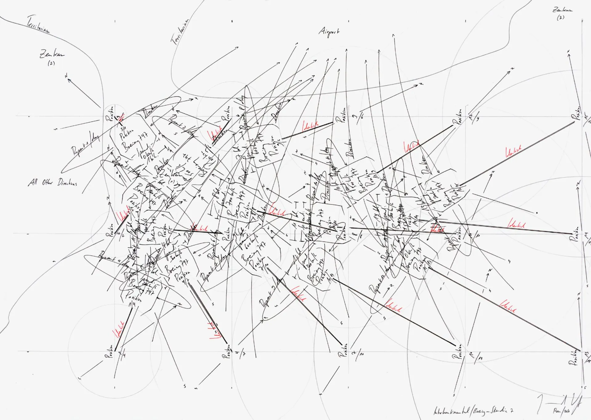
But does it float
Figure .
Figure . . Jorinde Voigt via "All language is mystification, and everything is fiction".
An "an ongoing visual conversation ... taking place inside a browser window" returning from the earlier version of this list.
- I can’t explain this attraction in terms of anything that’s familiar to you, because I don’t understand it in any terms that you are familiar with
- Shall I project a world?
- Everything tagged with architecture
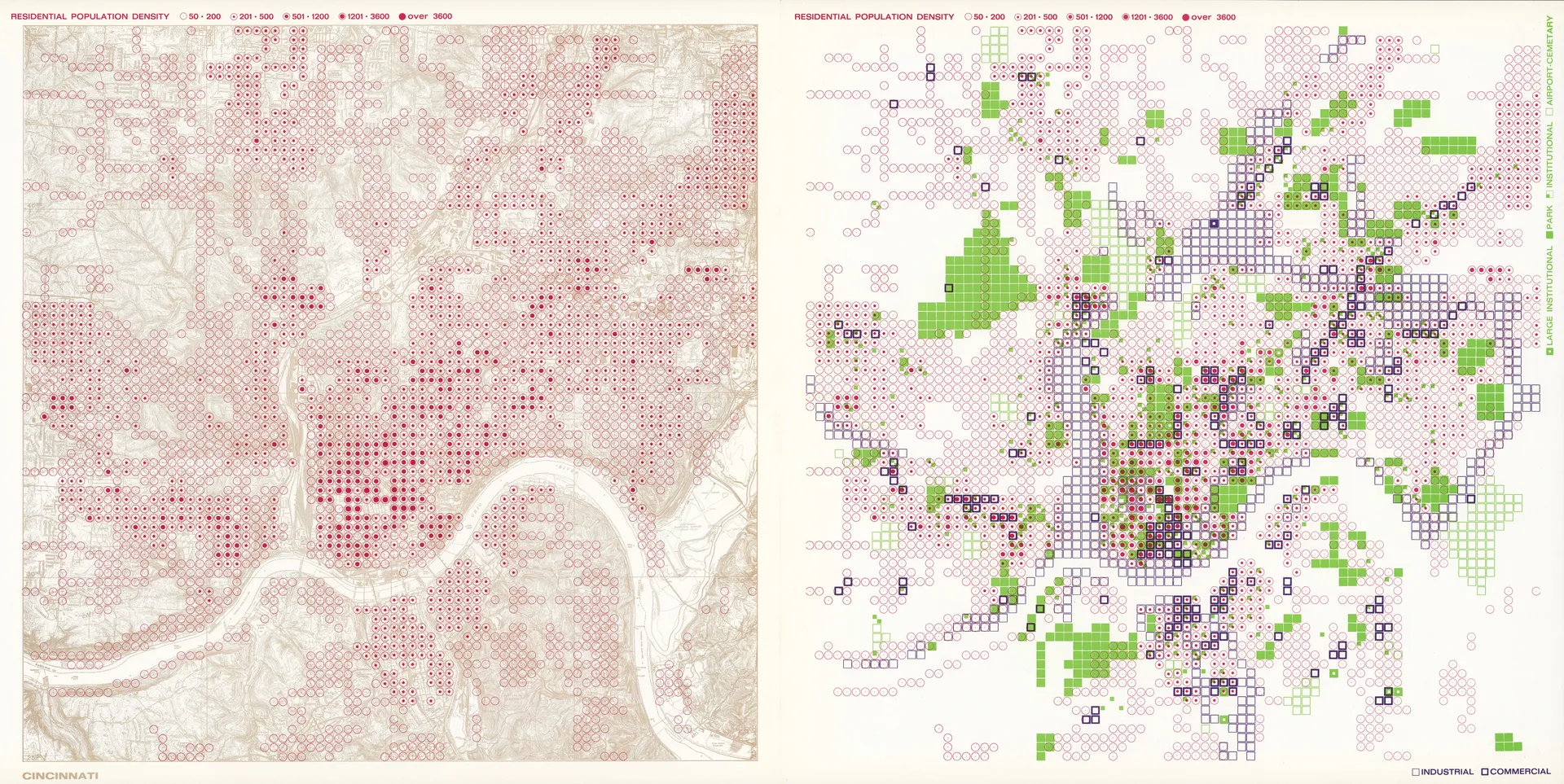
The David Rumsey Historical Map Collections
Figure .
Figure . . Richard Saul Wurman and Joseph Passonneau via The David Rumsey Map Collection.
Not so much a blog as a massive cartographic archive that also happens to have a blog.
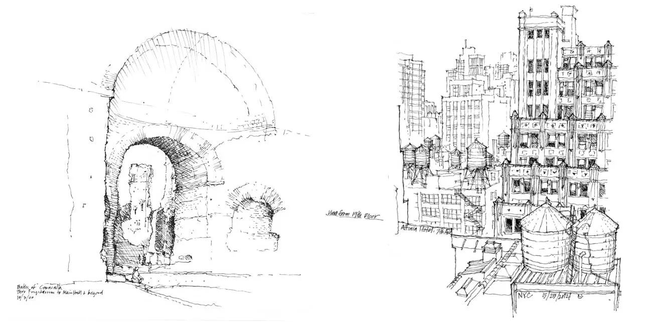
Frank Ching's Seeing.Thinking.Drawing
Figure .
Figure . . Francis D.K. Ching, from Planes of Focus.
Yes, that Frank Ching.
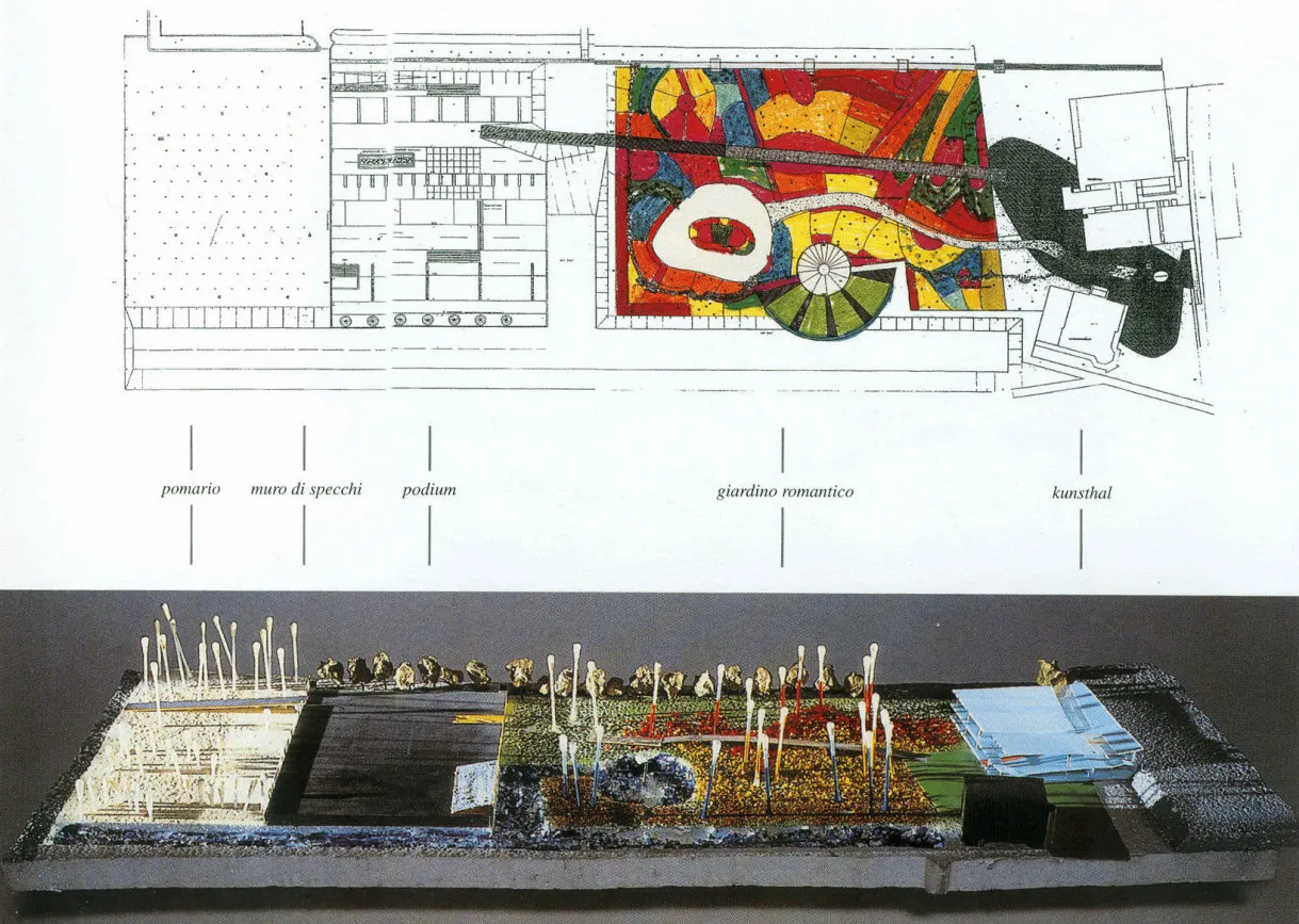
Iconic Landscapes
Figure .
Figure . . From Rotterdam, Museum Park, Yves Brunier, Petre Blaisse, Oma, 1994.
Great landscapes; great images.
- Bordeaux, Jardin Botanique, Mosbach Paysagistes, 2002
- Lille, Parc Matisse, Gilles Clément, Eric Berlin and Claude Courtecuisse, 1990
- Milan, Biblioteca degli Alberi, Inside Outside, 2018
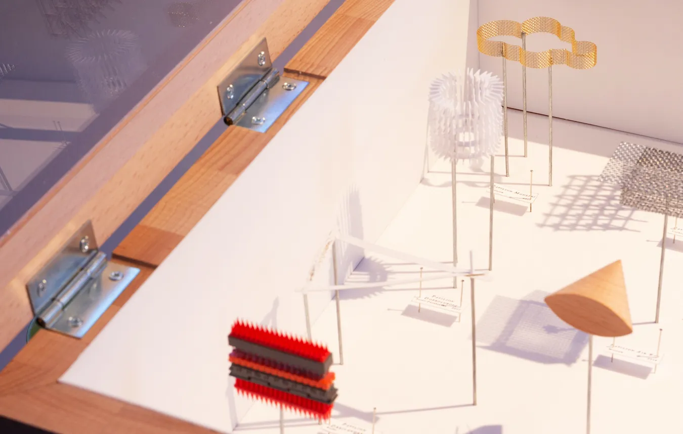
Koozarch
Figure .
Figure . . From Microtools, The Invisible Synapse: Pavilions.
The nexus of the post-digital style.
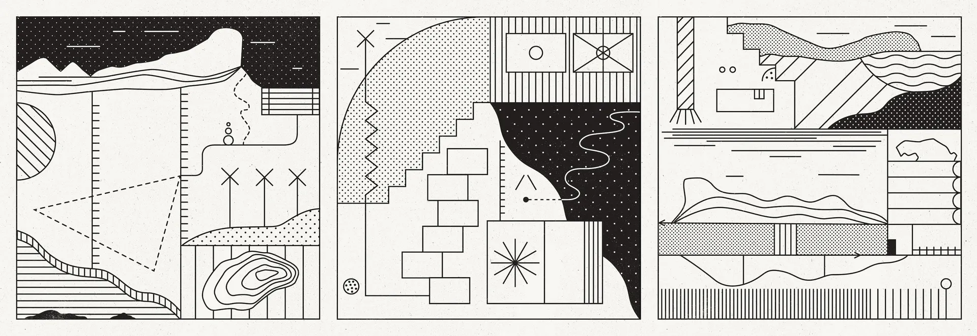
The New Aesthetic
Figure .
Figure . . Abstract Layers of Territory: Maps by David Lemm.
What if images, but too much?5
Socks Studio
Figure .
Figure . . Abstract Layers of Territory: Maps by David Lemm.
A "non-linear journey through distant territories of human imagination".
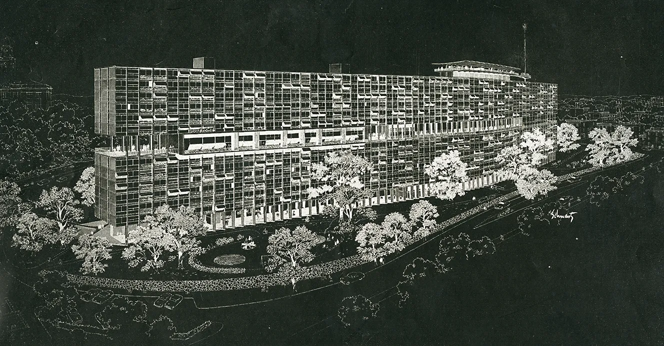
RNDRD
Figure .
Figure . . Eli Rabineau. Architectural Forum Apr 1953, 153.
A "partial index of published architectural rendering".
Footnotes
That said, companies such as Spotify and Audible are certainly trying to make the form proprietary. Remember: it's not a podcast if it doesn't have an open and accessible feed! ↩
Which is, as often as not, defined by interviews with landscape architects as it is architects. ↩
Coming from the perspective of someone who often wants to skim through lots of articles to find a reference. ↩
Instagram is web-accessible in theory but not in practice given its algorithmic timelines and restrictions on format/links. ↩
Following Daniel Mallory Ortberg. ↩
