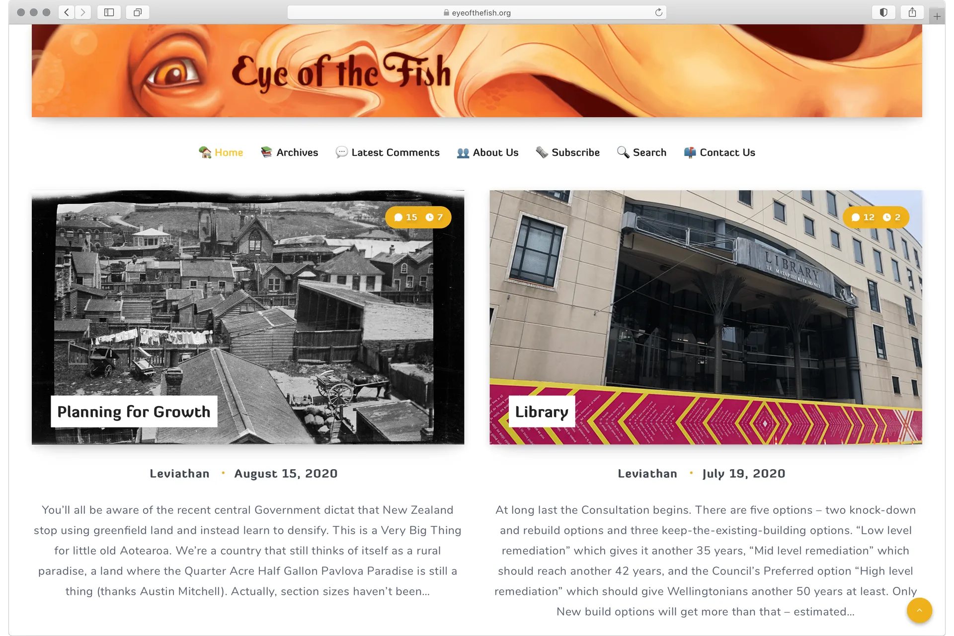
The Eye of the Fish is a blog focused on the urban environment of Wellington, New Zealand. It is now in its twelfth year running and host to over 900 posts and 10,000 comments.
The Eye opened to try to fill a gap in commentary and critique created when Tom Beard retired his WellUrban blog. I co-founded the site as a contributor and its designer alongside Maximus. My time writing for the blog lasted until 2010; a span that covered the last two years of my Bachelor degrees.
Although I never matched the output of my anonymous counterpart, the Eye provided a valuable space to try and re-apply the history/theory focus of my studies to a local context. The public and comments open nature of blogging at the time also made for quick lessons in the contested nature of urban space and the salience of architectural criticism. While the current web design is relatively generic, earlier iterations provided a chance to experiment with how to foreground locality and commenting within the then-limited framework of Wordpress themes.
My role in the blog lead to an interview for Urbis magazine and an invitation to the 'Humanising the City' panel discussion at the Wellington City Gallery.
Some select quotes from the posts of an over-confident and over-tired undergrad student:
Rock 2 Wellington
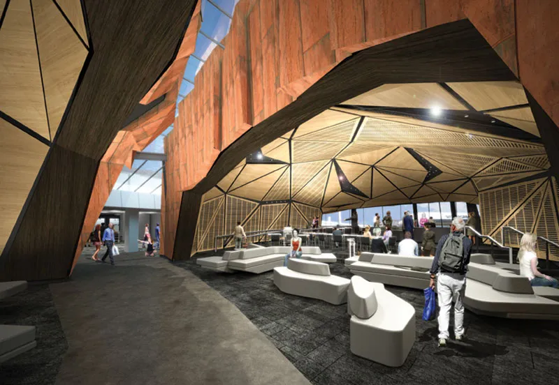
Ragged glass lines cut through the shell while the panelled facets create an exciting ceiling space. Inside is where the architecture is acting at its fullest effect: it makes superb use of the geology motifs without the burden of having to produce a unified image-byte. However, this singular image is exactly what the building set out to produce, and is the basis upon which it will be remembered and judged. ...The Rock sets out to create a very literal iconography. But in executing this, it has disregarded context and created an abstract aesthetic that defies the singular premise, ultimately failing at its literal and metaphoric agenda. It is like a Big Duck that doesn't sell poultry, or a Bilbao without the beautiful ambiguity. The design of the building itself may succeed, but the design of The Rock has been misshapen, misplaced and misinterpreted.
Liberating Everyday Life
Spread across several pages, the notes were mostly comprised of a series of diagrams that perfectly rationalised the design intent of Toomath. There were daily calendars — rendered as pie graphs — that displayed the schedules and requirements of each inhabitant throughout the day. Following from that was a series of clustered bubbles and initials that progressively planned the arrangement of spaces; eventually crystallising into the rectilinear cells that comprise the completed house. A box plot measured the levels of sun exposure against the needs of each space's function and time of occupation. A histogram deformed into protractor, becoming a hemispherical sun path that deduced the orientations required for each of the rooms.
Perhaps these diagrams are so fascinating to me because they associate the work of a mid-century modernist with a more contemporary use of the diagram. The great architects of the modern movement are typically viewed through a discussion of their principles and their praxis in the buildings they created. The intermediary step of the design process appears hidden away or disguised behind a few rough 'genius sketches'. However, the avant-garde of today — whose principles are far from unified — often seek to lay bare the design process, and the diagram is a key tool in doing so.
What is so surprising about Toomath's notes is to see the modernist design process in action. In contrast with the diagrams of contemporary architects, the decisions that Toomath makes with these diagrams are always logical and utterly self-evident. More than any of the models, plans, or photographs, Toomath's notes seemed to actualise the convictions of his 'fundamental modernism:' the perfect mapping of light, space and form to the needs of site and client.
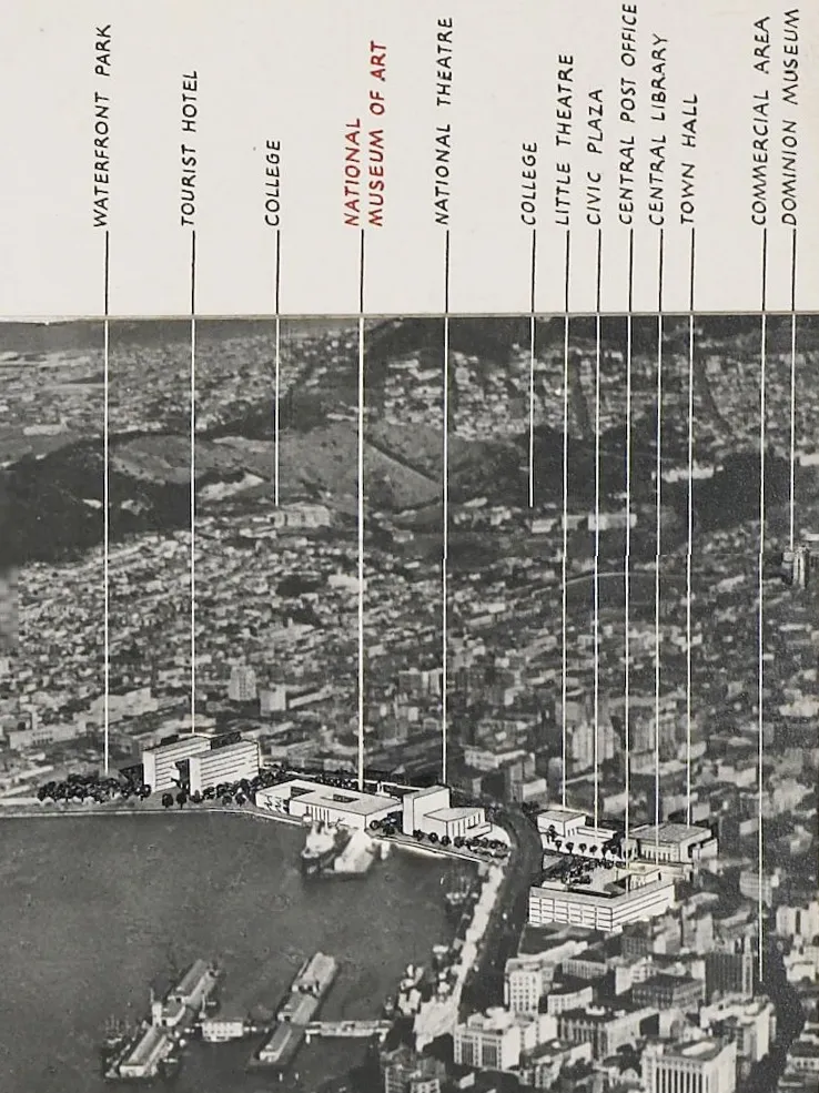
Courtenay Loses Parks; Gains a Park
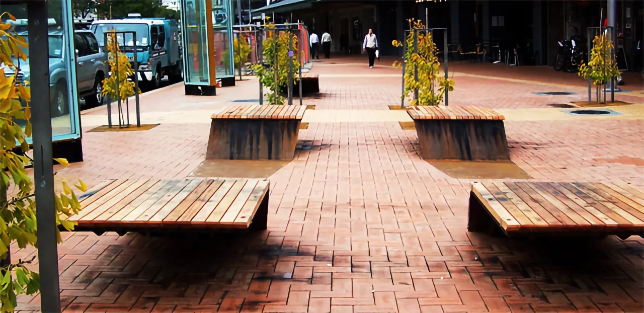
Wellington's ubiquitous terracotta tiling is out in full force. This, more than anything, enables the park to act as an extension of the footpath. While this is certainly in-line with the park's goals – would a greater variety in the ground plane be too much to ask? Even a minor substitution of the secondary tan brick would go a long way to creating more of a unique sense of place. ...Sleek and simple in their elongated S-shape, the seat/bench hybrids echo the rustic materiality that has populated the waterfront. Since their Ghuznee debut, they have gained a softer timber seat-cover, as well as map-etchings and swiss-cheese punctures that add character to the design. I have to admit, my first reaction to the design was: wait, can I stand on these things?